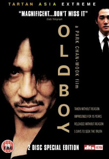
Monday 26 October 2009

Pepsi's Iphone App Uproar

Pepsi recently developed a new application for the iphone, called the "Amp up before you score" app- designed to provide men with chat up lines for 24 various types of women, while promoting the Amp energy drink. However, the application created a bad reaction from the public, forcing Pepsi to Tweet an apology, and further complaints led to the withdrawal of the app all together.
Overall, I like the idea of this promotion technique- it involves the specific target audience, and uses the medium of current popular technology. It also provides a clear personality to the brand. However I feel that Pepsi took it a bit far by encouraging female stereotypes, and feeding teenage boys a disrespectful outlook on wooing women, with chat up lines such as "I've discovered the source of global warming. You're HOT." I can't help but wonder whether there would have been such an uproar (including threats to boycott all Pepsi products) if there was a similar app for women too.

Wednesday 7 October 2009

Should Advertisers Risk Offending to Enlighten?


When researching for my Independent Project, I came across an article debating whether advertisers should shock people in order to create awareness. The example they used above is an awareness campaign by Cordaid, for third world poverty. Although the ad does shock you, I think that it shocks people into realisation, and thus successfully affecting the audience's views- a key aim in charity awareness campaigns. However I do think offensive material is an important consideration for advertisers, as it should be avoided in order to not create a negative reaction from the target audience.

Tuesday 6 October 2009

The Turner Art Awards

The Turner Prize 2009 exhibition opened today at Tate Britain, London. The four nominated artists are Enrico David, Roger Hiorns, Lucy Skaer and Richard Wright. The judges for the Turner Prize 2009 are Mariella Frostrup, Charles Esche, Jonathan Jones and Andrea Schlieker.My favourite is Roger Hiorns' piece bellow, where he has transformed a derelict flat into a cave of blue crystals.

Lucy Skaer is the artist who's work opens the exhibition. Below is her work 'coal dust', which, as implied, are sculpted from coal dust. I fail to recognise their beauty personally, and I was surprised when I read that they were praised for bringing beauty to something ugly- this isn't a piece of art that I would describe as beautiful! I would however describe Roger Hiorns' crystal piece as "turning something ugly beautiful".

Sunday 4 October 2009

Aubrey Beardsley

Writing about the 60s/70s music posters, and the Italian Medusa sculpture, I was reminded about one of my all time favourite artists and couldn't resist looking up images of his work. One in particular is the Salome piece shown above. It captures the biblical story of Salome ordering John the Baptist's head to be chopped, after he described her parents marriage as unlawful. Below is another one of his pieces, showing the intricate detail and flowing lines that I love in Beardsley's monotone pieces.

Soft Machine Promotion


For a few years now I have been interested in 1960s-70s psychedelic music posters and promotional material. I love the style, and the colour techniques they used. The bottom poster is one of my favorites and it really reminds me of one of my favourite artists, Aubrey Beardsley- in fact some of the posters resemble his style so much I'm pretty his paintings must have influenced many of the poster designs in the 60s/70s. I also like how you notice more and more as you study the picture- for example, the bottom poster shown above has the copy positioned to form the shape of a skull.

Medusa Sculpture

'Head of Medusa'
Sculpture
By Benvenuto Cellini.


I recently saw this statue in Florence, and was fascinated by it. I love sculpture, interested in mythological stories, and have always love artwork where there's a story behind it. The Statue has it all! Depicting the story of heroic Perseus decapitating the evil Medusa, the sculpture captures the gore and victory beautifully and dramatically. The bronze statue presents Perseus holding up the head of Medusa over her decapitated body, modelled with the writhing snakes of Medusa's hair.
The story behind the construction of the statue adds more depth and evil to the piece- Cellini used all his household cutlery and metal pieces in order to complete the sculpture, and as a result of it being so big, he set fire to the roof of his house as he stoked the furnace.

Ayios Neophytos Monastery


A Cypriot guy who I recently met was telling me about this monastery, and I had to look it up. It is situated in Paphos, South Cyprus and is thought to have been founded by a Cypriot Saint in the late 1100s. The reason I was interested in it was because he said the building was carved out of the mountain side, and is a beautiful piece of architecture to visit. Looking at the pictures I am a little disappointed- maybe he praised it a little too much for my imagination, as I expected something much more intricate. Still, an interesting piece and an alternative method of architectural construction!

Saturday 3 October 2009

No Sad Big Smile


This clever and original advertising campaign for Adidas caught my eye a while ago now, but it is one that I still think about and remember clearly- which is always evidence of a good, successful campaign. The video ad tells the story of a Japanese man's career as a break up service, presenting a range of situations he has to go through when breaking up with people on behalf of their partners. At the end it then shows the new Adidas clothing range in his scooter, marketed as perfect for stressful every day wear. Here is a link to it on you tube http://www.youtube.com/watch?v=sFaKNttGP9U

Although I'm unable to find the original website again, I remember the great impact it had, and the interactive services it offered. There was one that allowed you to send your own break up text using a choice of various messages, sent to your partner on behalf of the 'no sad big smile' break up service. I thought this was really witty, and an original concept- especially for a clothing line rather than something more directly linked like mobile phones.

Wednesday 30 September 2009

HR Giger

Alien (1979)


I was watching the film 'Alien' the other night and it reminded me of an artist I used to love- HR Giger. Cant believe I totally forgot about him! He designed all the alien spaceship interiors and the alien models themselves. I used to love his gothic artwork work when I was growing up- a more mature, horrific and detailed version of Tim Burton's gothic artwork. He inspired me through many of my GCSE artworks! Also a great film- I'm not one for fantasy Sci-Fi films normally but really like the Alien films. Maybe because of HR Giger's artistic input!

WWII Photography, Koln Cathedral

"Beyond this point you draw fire on our Fighting Men. He risks his life 24 hours a day, Do You?"
Just found this photograph on a cathedral architecture website. It shows an American soldier and a destroyed Panther tank in front of Koln, Germany Cathedral- 4th April 1945. I don't always like war photography, because I think they often always aim to capture the same theme of horror, when there are so many other reasons and affects of war. I particularly like this photograph though, as I think it captures a different side to war other than the process of destruction- It makes you wonder what the soldier is reading as he reads the sign. Pride? Guilt? You can see that previously there must have been lots going on, as the residue of the tank remains. But whats left is this aftereffect of war, and the emotions that this soldier is feeling as he reads that sign.
I also like the depth of field on this photo- the crisp, clear focus on the soldier and the sign, and the slightly, but not totally out of focus cathedral and tank behind them. It highlights the connection between the sign and the soldiers emotions, and the fact that both are a product of the destruction of war seen in the background.

Pisa Cathedral- Table Design


Apologies for the bad quality photos- I figured they were better than nothing. During my recent holiday in Italy, I was very aware that we were not to collect 'holiday snaps' for our blog. The design of this table in the Pisa Cathedral interested me though- two marble carved angels holding up one slab of marble to create the Alter table. The design intrigued me, as there were no extra legs to support the table, and the two angels were carved differently making it more difficult to create a balanced structure- the mathematics that must have gone into the design of this table must have been so accurate so ensure a level table with sturdy support. The carvings of the two angels were also beautifully done, adding character to the piece, and an alternative and more modern design to interior of the Cathedral that surrounded to table.

Sunday 13 September 2009

Nevermore 3


My fellow graphic designer friend from back home has always particularly been into animation and games design, and has great experience from this platform game he designed and created in his own time. He's already managed to sell it as a feature for a website, and has received great feedback from other sites including e4 http://www.e4.com/game/nevermore-3/play.e4 click here to play the game!

What I particularly love about Adam's game is the style and beautiful design behind the game. Although I'm not really into games design myself, I can definitely appreciate the time and skill that has gone into this.

Product Placement: UPDATE

After my previous blog entry about 'Product Placement in the UK', there have been some dramatic changes! Today I heard on the news that the Government has lifted the ban on product placement, thus changing the future of British TV forever. I wonder why the government made this major U-turn in their views of product placement, as my last blog entry on this subject discussed, they previously seemed really against the idea. Perhaps it's the £100 million a year that this move will be worth to commercial channels- an economic boost they could all do with in the current situation.

There are some exceptions however. The BBC will still be prevented from using product placement, but do still benefit from the change as it will reduce the pressure on the BBC to share its £3.6 billion income from the license fee. Another exception will also be children's TV.

I think if done well, this will certainly have a positive impact for both advertisers and broadcasters, not only because of the large amounts of money it will bring in, but also because of the self-scheduling method of watching TV that is becoming more and more literal. Many digital packages such as Sky+ allow viewers to fast-forward commercial ad breaks, making them less successful for advertisers, and therefore making less money for broadcasters too. Product placement could therefore open doors for advertisers and broadcasters where others are being closed- there couldn't be a better time for it.

McCurry Branding Row

American fast food company McDonald's have just lost an 8 year legal battle with Malaysian fast food company McCurry, as McDonald's argued that they were infringing their trademark rights by using the 'Mc' prefix in their brand name. The owner of McCurry explained that he used the brand name as an abbreviation of 'Malaysian Chicken Curry', and it was ruled by a federal court that there was no evidence of him trying to promote the company as part of the worldwide brand of McDonald's.
When I initially saw the logo for McCurry it really did remind me of the McDonald's brand. But as the 'Mc' prefix is common in surnames anyway, and the owner seems to have a valid reason for using it, I don't see how McDonald's can really copyright the use of it. Perhaps if the Company used an alternative colour scheme it wouldn't resemble McDonald's as much. I think the ruling was fair though.

The Shock Tactic in Advertising... UPDATE

Just read Elizabeths Pisani's view on this advertisement in the Guardian, who objects to the ad but not due to the shock tactic. She points out the inaccuracies of the ad- 500 people died if Aids in Germany in 2007, which is no where near as many people as Hitler killed. She also points out that "almost all sexual transmission of HIV in white communities in Western Europe is between [gay] men", so targeting straight women will hardly reduce the risk of HIV in gay men. The advertising agency 'Das Comitee' who did the campaign did it unpaid- perhaps this accounts for the lack of research into who they should be targeting? unless the brief stated it of course... Pisani also argues that HIV is no longer even a mass murderer in rich, developed countries, and more an "inconvenient disease that will have you taking pills for the rest of your life [and] cost taxpayers lots of money".
If the agency simply did this to promote themselves, and saw it as an opportunity to create a shock-campaign in order to receive world-wide media coverage, it definitely worked.

Wednesday 9 September 2009

The Shock Tactic in Advertising...

Too Far or Highly Effective?


A recent advertising campaign in Germany caused controversy, when an Aids awareness campaign showed a woman having sex with a series of mass murderers, including Adolf Hitler, Saddam Hussein and Joseph Stalin. The Hamburg advertising agency, Das Comitee, used the shock tactic to highlight the dangers of unprotected sex and the horrific 'mass murder' effects of aids, with the slogan "AIDS ist ein Massenmorder" ("AIDS is a mass murderer"). The creative director of the agency said their aim was to "show the ugliness of the illness, not of aids victims", but various Aids organisations across Europe have condemned it, saying it represents aids sufferers as mass murderers.
I can definitely see how aids sufferers would be offended by this, as it appears to represent the sufferers as the murderers rather than the illness itself. However, I think this shock tactic will definitely work as an awareness campaign, and make people realise of how easy it is to contract aids. Another criticism though... if you watch the TV/Cinema advertisement http://aids-ist-ein-massenmoerder.de/typo3/index.php?id=aids_kampagne&L=1 there is no advice on how to prevent catching aids.

Ambient Advertising

UKTV channel Dave recent advertising campaign...

The marketing people behind the UKTV channel Dave recently came up with an ambient marketing campaign, just in time for this years channel of the year awards. They placed a couple of old brown suitcases, presented with stickers on them reading "The case for Dave", onto baggage carousels at Edinburgh airport. They were heaved off, and on again, over and over. Although being the perfect time of the year for the use of this location for a campaign, I wonder why they only did it in one airport, and not in others and train stations. However, I also don't admire the campaign much for lack of creativity, and realise maybe the campaign wasn't very successful and so resulting in no further coverage.

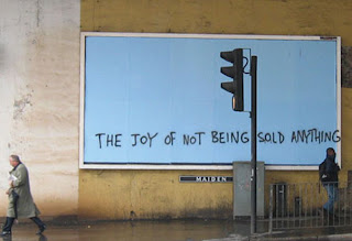
I found this much more creative Dave campaign from last summer to promote the "summer of funshine" schedules, which will see great British comedy series, such as Blackadder, Open All Hours and The Vicar Of Dibley, broadcast every evening. The campaign says much more about the channel's personality, involved the public directly and was more widespread. The initial aim was to sponsor students as human billboards, and to stencil faces of British comedy onto their back. However, as the campaign became more widespread, anyone and everyone who wanted to get involved could. This campaign appears much more thought through- it's fun and links to the promotion directly, while in keeping with the summer spirit and British comedy.

Wednesday 2 September 2009

American Apparel Ad Ban in the UK

I have just read in an online news article, that the UK advertising standards authority have made the decision to ban a campaign by American Apparel retails. This was due to a series of photos of a model who appeared to be under the age of 16, who was stripping off for what looked like an amateur porn shoot.
The ban came after the ASA received a complaint on the campaign, that it was offensive, unsuitable for younger audiences, and inappropriate, as the model appeared young and vulnerable. American Apparel defended the ad, by saying the model was supposed to be perceived as a 23-year old woman, relaxing in her hoody around her apartment, in order to reflect the soft-to-touch material. The ASA agreed that they had not breached any of the advertising codes on nudity, but banned the ad on the basis of the model appearing to be under 16, and progressively showing more and more flesh through the series of photos. They concluded that the ad could create serious offense for some readers.
Although the ad doesn't show much nudity, I can definitely see why it could cause offense, as the girl does appear to be very young and naive, and rather vulnerable to the situation. American Apparel have created a lot of controversy over their sexual campaigns in the past, so this comes as no surprise to me.

Tuesday 1 September 2009

Dr. Gunther von Hagens

My previous post on Damien Hirst brought up a discussion between my sister and I about artists who dissect animals and plants for their artwork. She showed me a catalogue from an exhibition she went to on Dr. Gunther von Hagens' work, which I know she has researched and studies quite a bit. I've never really taken much notice of his work before, as I didn't really want to see dissected and stripped human bodies, but some of the ones shes showed me were artistically presented in various ways, using a range of techniques. I also feel strangely more comfortable about his work than I do with Damien Hirst's, as I know all the people he uses have signed up and volunteered for their bodies to be used once they have died. I also spoke to my housemate who is a medic, about Dr. Gunther von Hagens' work, and he was very in interested in seeing some. My sister said that the exhibition attracted a lot of medic students interested in the dissections, as well as art lovers- I think it's great how he's managed to add this unique take on art, and attract many different audiences.

One of his techniques is also interesting, as he injects their blood streams with plastic based material, allowing it to take the form of the body.

Friday 28 August 2009

Death Valley Ghost Town

A couple of years ago while travelling around West Coast America, I accidentally came across this ghost town I have since learned is called Rhyolite. unlike other ghost towns I visited, it's none commercialised, and can be seen totally how it was when the last person left, exposing it to natural changes over time. It was so eery especially being situated within the hottest place on earth, and within an area titled 'Death Valley' due to these deathly humid and hot conditions. Very little animal life can be seen- very rarely maybe a snake, but no sound except the warm breeze can be heard. Adding some strange, contrasting forms to the naturally disguised homes and cars that have been deserted, is the Goldwell Open Air Museum including the Ghost sculptures shown below, which play upon the deserted area and the eery-ness of the town.


I have since learned that the town is becoming much more commercialised and promoted, which I'm disappointed about- Stumbling across the town allowed me to get a true feel for the atmosphere and a sense of discovery and exploration into a world where people once lived.

I have also just read that there are a range of films created there, including 'The Island' which was recently on TV. I wish I knew that before I watched it as I would have appreciated the setting a lot more. I'm not surprised to learn that other films such as 'The Arrogant', 'Ultraviolet' and 'Bone Dry' were filmed there, as its such an atmospheric place, and must save a lot of money rather than designing and creating an environment set from scratch.

Gustav Adolph Mossa

Last summer when I visited Nice, while travelling to Italy, I discovered an artist who I'd never heard of before. Gustav Adolph Mossa's artwork was on display in the Musee des Beaux- Arts in Nice when I went, and I was amazed by the fine detail in his work. As a designer who used to paint a lot, I find his work very inspirational through his technique and style, and the themes of his artwork often very intriguing. Bellow is one of my favourite pieces of his- 'Pierrot s'en va'. Every time I look at it I want to know the story behind it- I'm not sure if I've made this up through my imagination, or whether it's the true depiction, but I think the main clown-like character has just stabbed himself, for his loss over the women in the background who he loves. This is something I certainly want to research.


Nature's Design


Nature is always an inspiration throughout various aspects of design. I love this photograph of icicles over a car, and the tree in the background. It looks like the falling of ice frozen in time, with the icicles pointing in the direction of the wind. I can't remember where this was taken which is a bit annoying, but it's still a great photo to look at. I would definitely hate to have to walk to Uni over that though!

The Basilica di Santa Maria del Fiore


While in Italy over the summer, I visited this beautiful Cathedral. Although I have visited hundreds of Cathedrals during family holidays in the past, and despite previous to the holiday deciding not to write any entries on Cathedrals or churches that I visit, I couldn't resist this one. I have never experienced an architectural design so exquisite and breathtaking. When we sat by it to eat our lunch I found it's beauty and elaborate design kind of surreal. Although quite garish and its criticism for being overly fancy, I really admire the design and time that must have gone into every statue, and every pattern design. The inside is somewhat odd in that it's so unlike the facade- bare, gothic and quite empty, which was designed to represent the austerity of religious life.

Advertorials

The Line Between Editorial and Advertising.
'Supplementary Income' The Media Guardian, 31/08/09
Advertorials are becoming more common and increasingly subtle, resulting in many initially being confused with journalism articles rather than a promotion. The Daily Express was heavily criticised earlier this month by the Advertising Standards Authority (ASA) and Watchdog, for disguising advertorials as news stories (the Goldshield Rozip advertorial pictured below). It is within the ASA code that all advertising features must be clearly labelled as an advertisement.

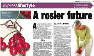
Despite this criticism of the Express as a result of advertorials, as marketing budgets become more strained, advertisers who are looking for better ways to make brands stand out are increasingly turning to advertorials. Justine Southall, publishing director of Cosmopolitan, says that last year was their best ever for advertorial features, and that this year they are on a similar track. Southall recognises the importance of the relationship between the reader and advertiser, as it can also effect attitudes towards the magazine. All advetorials must be clearly labelled, "[including] making sure the point size of the 'Cosmopolitan Promotion' is clearly legible." She also recognises that other publishers may be purposfully disguising promotions with unclear advertisement labelling, due to the current economic conditions, and says that "this is really dangerous for the long-term health of a brand."

Advertisers are not attracted to the fact that readers may be put off reading an advertorial if it is labelled as an advert, and are so looking for alternative methods of attatching brands to editorial. But feature editors themselves are very warey of getting carried away, and ensure not to push too many products into editorial spaces, in order to avoid annoying readers.

In conclusion I think it is both advertiser's and media owner's responsibility to manage the line between advertisements and editorials. Advertisers must satisfy the ASA's code, and journalists must control the level and amount of advertorials readers are presented with. It will also be interesting in the future to see what new ways advertisers will be linking brands to editorials.

Product Placement in the UK

The ban of product placement is viewed as a problem by many advertisers and broadcasters, especially since Andy Burnham, then the culture secretary, earlier this year said that the ban would continue for UK television. He said it would blur the boundaries between advertising and content, and his "priority has always been to make sure we maintain levels of trust between audiences and broadcasters, and protect the standards of broadcasting for which Britain is known worldwide." Cody Hogarth, managing director of New State (Endamol's branded content division), backs up Burnham's decision by saying: "I don't think we'd ever find a commissioner who would take a programme that had product placement all over it."

The Conservative party however, has a different view, as they say they would relax the product placement rules- Ed Vaizey, the shadow minister for culture says "We don't think that product placement is a panacea for all the ills of commercial broadcasting. But we do believe that we should relax the rules." It has been estimated that product placement in the UK could be worth between £40m and £70m a year. Vaizey says "we also trust the broadcasters to understand their audience."

All parties also recognise that UK viewers are already viewing heavy product placement in programmes imported from the US. Mark Eaves (managing director for Drum PHD media agency) says "we either level the playing field or we take steps against imported programmes and series."

I know there has been concern about whether UK audiences would react well to product placement in programmes, but as Eaves points out, we are already used to it from the imports. Surely the decision should be whether we allow them on all programming, or not at all. However, Rabin Mukerjea, partner at the Grand Central Entertainment content agency, disagrees with this. "If there was a way of us fast forwarding, we could do what the US does- right now we'd be starting from year dot, so how long it would take to learn that lesson I don't know." Mukerjea argues that it's not a case of either having it everywhere or not at all. It would be something that programmers would have to ease into, with a risk of how audiences would react- US audiences are used to it everywhere as it blends into backgrounds. But product placement may stand out and distract audiences in the UK.

Monday 24 August 2009

Damien Hirst- my criticism

As this is a blog for our personal opinions and critical analysis, I thought I should express my log term negativity toward the work of Damien Hirst. Although I admire his in depth meaning to his pieces, and the unique solutions he creates, I hate the fact that a lot of his work he doesn't actually create. He does have the initial ideas and concepts, but then he just passes them on to someone else to implement for him, while he receives all the credit notably the various animals he preserves and displays in formaldehyde.

His work has also been criticised a lot in the press, particularly when he won the 1995 Turner Prize. The exhibition of 'Mother and Child Divided' (below), and 'Away From the Flock'. Norman Tebbit who wrote for the Sun, said "Have they gone stark raving mad? The works of the "artist" are lumps of dead animals. There are thousands of young artists who didn't get a look in, presumably because their work was too attractive to sane people. Modern art experts never learn." This is a statement that I strongly agree with- there are so many more talented artists out there.


Saturday 1 August 2009

Advertiser-Funded Programming

Is AFP the answer for both Advertisers AND Broadcasters?

After reading an article in The Guardian's 27/07/09 Media supplement, it got me thinking about a method of advertising I previously knew little about. This is probably due to the fact that it is a method of advertising that is not widely used, but as the article suggested, it could become a more popular technique, with advantages to both advertisers AND television broadcasters.
Although Advertiser Funded Programming (AFP) has been around since the first American radio soap operas in the 1930s, few advertisers have chosen this method to reach their audiences due to the lack of clear marketing value. However, with the current economical situation, and the recent interactive technological developments, AFP could be the answer that both advertisers and broadcasters are looking for.

Commissioners were initially concerned whether AFP could deliver quality programming, which meant for many years it was considered as a risky choice for broadcasters. Earlier this month however, Nintendo and Channel Five announced a new prime time AFP show they are planning to launch- 'Britain's Best Brain'. The software company Sage also funded the majority of ITV's first prime time AFP last October- 'The Krypton Factor'.

David Brennon, research and strategies manager for the TV marketing body Thinkbox, says AFP will become a more widely used marketing meothd, as although "total sponsorship is estimated at £200m, and AFP is a small subsection of that at the moment... it will surely grow as brands see the power of association." This introduces the idea that more advertisers may recognise AFP as a method of advertising that they could benefit from. For example, target audiences will associate Nintendo DS with 'Britain's Best Brain', which will reinforce its brand profile as an intellectual and "brain training" product.

AFP could also be the answer to the decreasing television programming budgets. Mark Eaves, managing director of Drum PHD (the media agency behind the Krypton Factor deal), says that despite commissioning budgets already being driven towards peak-time terrestrial, "everyone is under pressure now, so any content with new funding is quite welcome."

Is AFP really a good deal for advertisers though? In an AFP deal it is the broadcaster who has the creative control. And with product placement banned in the UK, at the price of some, if not all the production costs, exclusive ads and a mention in the credits has often been considered as not a great side of the deal for advertisers. However, the recent digital interactive developments are making AFP more attractive, as it's moved on from the flat deal of advertisers investing large sums of money with little marketing value in return. Through the medium of the programme and anchoring material, specific audiences can be reached by advertisers through direct links to the brand. For example, a link on ITV.com's Krypton Factor page takes you to Sage's Trainyourbrain.com, offering mental games based on the Krypton Factor style, while promoting the brand. There is also the interactive support of the red button for Sky and digital users, and of course forever developing technology could open up many more interactive options.

Although the current economical situation and recent technological advances would suggest AFP offers many benefits to both advertisers and broadcasters, it's still too risky to jump into. Time and trial are the best measures of success for the method, especially as audience responses are an important consideration, and with current concern as to whether viewers would reject ad-funded programmes.

'Strange Days and Some Flowers'


'Strange Days and Some Flowers' Exhibition
Multiple artists.
The Storey Gallery, Lancaster.

Due to the gallery's copy right restrictions, I am unable to put up photos of the artwork. There are photos on the web site www.storeygallery.org.uk/programme.php?item=000029 and the flickr site www.flickr.com/photos/storeygallery/sets/72157621388108098/

Although I would say this small exhibition isn't worth making any special trips for, I would recommend having a gander if you're around the area, as it's free entry and I quite enjoyed it. It includes paintings, installations, pottery, architecture models and sculptures by the following artists- Dan Baldwin, Don Brown, Laura Ford, Matthew Holding, Robin Mason, Jock Mooney, Mika Rottenberg and John Stark.

The relevance of the title is rather unclear to me, other the the word 'strange' which describes it quite accurately. To me, the link between most of the work apears to be: a surreal and distorted vision of nature and reality that is often a playful and/or dark take on modern society. A good example of this would be Don Brown's 'Yoko XIX' and 'Yoko XVII' sculptures, which are exactly the same apart from the material and the colour- the first one is black and the second white. They are sculptures of a figure that appear to be draped in cloth material. The drape contors are sculptured really realistically and work well with the medium surface texture, as initially I thought it was a shiny latex material draped over. What I found interesting though was that a simple difference of colour can make a big differnece of perception- the black one immediately looked dark, dangerous, threatening and evil, and the white one looked pure, heavenly and peaceful. This colour difference may sound obvious but it made me think about how it relates to the world and our society- due to individual past experiences and social stereotypes, people often differ their views and judgments for two similar situations that have a slight degree of difference, such as age, sex or background for example. It also highlights the importance of colour as a graphic designer, as it can really alter how people decode and view our designs.

Another interesting piece was an installation by Jock Mooney titled 'Discontinued'. It features plastic models placed on and around a large, permanent statue within the gallery, of Queen Elizabeth I (?). It creates the playful and distorted vision of nature that I referred to earlier, with various little models of animals and toy-like figures. My initial perception of it was that it was an immature illustration of life. However, as I looked closer I notised hidden, dark aspects that resebled death and violence including a reef of bones and eyeballs and body parts scattered behind the statue- this was clearly a much more blunt and significant outlook on life than the 'immature' outlook I initially thought. The overall style of the models reminded me of the E4 'Hotel Room' and 'Beach' idents, which caused me to lack admiration for the installation, as I got the strong feeling I'd seen that style before. I have much more admiration and respect for artists and designers who create their own style, so this just gave me a 'nothing special' attitude towards the piece.
I would recommend this exhibition, as it had an interesting variety of work. But like I said- it's a very small exhibition (just 24 works) so not worth any extra trips.

Wednesday 29 July 2009

Blue

Below are a few points of thought on the colour blue that I've taken from an article in The Guardian written about by Miles Davis' album 'Kind of Blue' (25/07/09, extract from Richard William's book 'The Blue Moment: Miles Davis's kind of Blue and the Remaking of Modern Music'). As we all know, different colours and shades can reinforce various emotions and alter our interpretation of things. But some of these debatable ideas and facts also take blue into account as a word and a music genre, offering possible inspiration for further use and thought of blue- both visually and audibly.
A lot of the article appeared to be so distant from likely interpretations of blue, I would say much of what Richard Williams has written about 'blue' as a colour is probably not even worth taking into account! But it is interesting to read about cultural ideas and artists' views of the colour blue...


- "A nice word to say, and to sing, the gentle explosion of its initial double-consonant immediately softened and then succeeded by a long and shapely vowel."
- 'L'heure bleue' (the blue hour) is a time between work and play defined by "transience and evanescence"- basically a time between two aspects of life, which briefly passes and quickly fades away.
- Blue is the colour of:
the Virgin Mary's cloak
Tribal dyes
The suits worn by J Edgar Hoover's FBI men
Rock 'n' Roll denim
- Some expressions, film and music quotes that have used and phrased various shades of blue: Blue velvet, blue angel, blue valentines, blue moon, blue and sentimental, love is blue, way to blue, midnight blue, almost blue, born to be blue, blue on blue.
- "Goethe dressed Young Werther in a blue coat and, in his 'Theory of Colours', observed that "blue brings the principle of darkness with it"".
- Rilke wrote his poems on blue paper.
- Cezanne believed that by adding blue to every colour on his palette he could create the sense of natural light.
- Kadinsky wrote: "Blue unflods in its lower depths the element of tranquility. The brighter it becomes, the more it loses its sound".
- Matisse once said he was "pierced in the heart" by the blue of a butterflies wings.

My painting of 'The Little Fourteen Year Old Dancer'


Painting of the Sculpture
Acrylic, lace.

By request from Laura! This is a painting I did of the sculpture a few years ago. This was part of a study rather than an actual piece. I think it was part of my GCSE project so it was quite a while ago now! I was very encouraged to capture the use of mixed media, as this is a key aspect of the sculpture that I admire, along with the childish confidence of the pose.

Saturday 18 July 2009

The Little Fourteen-Year-Old Dancer, Edgar Degas

[Sculpture]
The Little Fourteen-Year-Old Dancer
By Edgar Degas (1834-1917)
1880

This is one of my all time favourite art pieces that I have loved since a very young age! I think I must have loved the innocence and beauty of the stucture, and was inspired by the use of various highly relevant medium, so much I did my own mixed-media painting of it. He carved her with wax, using a real ballet dress and shoes, and horse hair for the hair.
I just read an article in The Guardian that said one of the sculptures (he did a few variations of it) was sold for £5m five years ago, and is now back in the transfer market at £12million. Gutted I'll probably never get to own one! But I saw her last summer at the Liverpool Tate, and she can also be seen in the musee d'Orsay in Paris.

Wednesday 8 July 2009

Christian Louboutin spring/summer 2009 ad campaign


Fashion ad campaigns are becoming much more than just photo shoot photography of skinny models in expensive clothes. This Spring/Summer, Christian Louboutin has launched a new campaign, resembling the artistic influence of the Baroque era. Peter Lippmann, the still life photographer behind the campaign, has taken inspiration from 17th-18th artworks, particularly painters of the Dutch Golden Age. The shoes have been arranged in still life to resemble classic paintings. I love the unique take on this fashion campaign as, although the style itself is not unique in the art culture, for fashion it is a very original angle. If I were to come up with this concept, particularly for fashion, I would worry that the old fashioned style would create similar impressions of the shoes. However, it has been carried out beautifully, and represents the brand of Christian Louboutin, and Baroque art beautifully.

Monday 29 June 2009

Fashion Sex Campaigns

For a long time advertising campaigns have used sex as a theme to sell, particularly for fashion campaigns where they aim to represent people as sexy. However as some of these that I have found show, it can often be taken too far.

Below is an image from a 2007 Dolce and Gabana campaign, which was heavily criticised for glorifying gang rape. This lead to the campaign being banned in Italy.
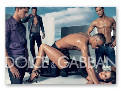
Much more provocative, is the 2007 Tom Ford for Men campaign below. To me this campaign offers little creative imagination, and is just using the woman's body in a tacky and distasteful way, at an attempt to clearly try and be controversial. Tom Ford supported the campaign by saying its sexy, which I definitely disagree with. This one, believe it or not, is one of the tamer images that have been used for the campaign.


In my view, a lot of these campaigns are deliberately ignoring advertising standard's regulations, and creating media hype in order to create maximum awareness and coverage for the brand. A lot of them probably aim to get banned, and make it a competition to see which can be the most controversial.

Friday 19 June 2009

'Old Boy'


[FILM]
'Old Boy'
Directed by Park Chan-Wook
Won the Grand Prix award at the 2004 Cannes film festival.

My Korean housemate recommended this film, and as I had never seen a Korean film before, I was quite intrigued simply to see whether the film techniques and style were different to that produced in America. I was pleasantly surprised- although pleasant is probably the wrong word for this gripping, ultra-violent revenge plot. I was not only surprised by the high production values but also the the well written narrative. The obvious route would be to compare this film to the revenge-thriller 'Kill Bill'. Although the summary of the plot may apear rather similar (a man who has been locked in a cell for 15 years without explanation, is freed and goes on a rampage to seek revenge), 'Old Boy' is much darker and has more twists - definitely a narrative that is less obvious and predictable. Although when viewing the film I picked up on a few characteristics that were similar to 'Kill Bill', it wouldn't be fair to suggest that one influenced the other, as they were both produced in 2003.
'Old Boy' became controversial in 2007, when it created media hype and moral panic, as it was said to have influenced the shootings by Cho Seung-Hui. This was due to photogrpahs that the killer took of himself resembling scenes from the film. The film features scenes described by an article in The Sun (20.04.07) as "tongue slitting, skull hammering, dental torture and someone eating a live octopus", and headlined the article "Cho 'copied' video nasty". In a similar but more balanced article (April 2007), The Telegraph pointed out that although the photos "show Cho holding a gun to his head and wielding a hammer, images that appear in the film, [he] made no reference to the film in any of his accompanying notes and messages". Although it is a very violent film, there has been no proof of any copy-cat murders, and my view is that it was simply another moral panic created by the media in order to sell.
One negative aspect that my Korean housemate pointed out while watching the film, was his frustration over the inaccurate translations of Korean to English in the subtitles, which resulted in some of the script being less effective and dramatic as probably intended. He pointed out even odd words that could have been translated better and more effectively. However, I presume this is a problem with any translated film.
Now I feel I have warned enough about the violence (it really isn't that bad but I know some people may want to look away!) I also feel the need to mention the narrative twist that some may frown upon... I will say no more so not to ruin it, but it's kind of... sick!
One last thing- I have also read that Will Smith has signed up to star in a 'family-friendly' Steven Spielburg make of 'Old Boy', which I initially wasn't keen on the idea of, as it sounds like they are planning to change it quite a lot. However, it also sounds like the Hollywood version will bear no resemblance whatsoever to the original, and will in fact be based on the original manga comics rather than the film, so it's probably worth giving it a chance as a completely different film! It's currenlty at the centre of a legal battle with the publishers of the manga comics, so there is no certainty as to when, or even if, the American adaptation will be made.
.
.
Peter Bradshaw (The Guardian): "When it comes to gut-wenchingly violent cinema, the Koreans are going further than anyone. And doing it better, too."

Daniel Etherington (Channel 4): "Intense and dark but also humorous and moving, this is an ambitious film that fulfils its promise, despite an arguably overly protracted denouement. Excellent."

Jamie Russell (BBC website): "With its twisting and turning plot, it's hard to talk about Old Boy without spoiling the delirious sense of disorientation that awaits first time viewers."

Saturday 13 June 2009

'Pictures of Walls' -not the best graffiti...


[BOOK]
'Pictures of Walls'
Compiled by Banksy/ POW
This book presents graffiti and city wall scrawls from all over the world, where people have used the city environment to create something new. Although most the graffiti shown in this book is artistically lacking skill, and certainly not what you would normally consider 'graffiti art', their aim is to deliver a message in a blunt and direct fashion, and are often funny and quite clever. After looking through this book I have notice more hidden images around me and look at things differently. The images in this book plus a load more can also be viewed at http://www.picturesofwalls.com/ where you can also send in your own photos.