Lucy Skaer is the artist who's work opens the exhibition. Below is her work 'coal dust', which, as implied, are sculpted from coal dust. I fail to recognise their beauty personally, and I was surprised when I read that they were praised for bringing beauty to something ugly- this isn't a piece of art that I would describe as beautiful! I would however describe Roger Hiorns' crystal piece as "turning something ugly beautiful".

 Writing about the 60s/70s music posters, and the Italian Medusa sculpture, I was reminded about one of my all time favourite artists and couldn't resist looking up images of his work. One in particular is the Salome piece shown above. It captures the biblical story of Salome ordering John the Baptist's head to be chopped, after he described her parents marriage as unlawful. Below is another one of his pieces, showing the intricate detail and flowing lines that I love in Beardsley's monotone pieces.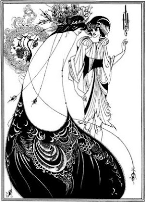


.jpg) "Beyond this point you draw fire on our Fighting Men. He risks his life 24 hours a day, Do You?"
"Beyond this point you draw fire on our Fighting Men. He risks his life 24 hours a day, Do You?"

 Apologies for the bad quality photos- I figured they were better than nothing. During my recent holiday in Italy, I was very aware that we were not to collect 'holiday snaps' for our blog. The design of this table in the Pisa Cathedral interested me though- two marble carved angels holding up one slab of marble to create the Alter table. The design intrigued me, as there were no extra legs to support the table, and the two angels were carved differently making it more difficult to create a balanced structure- the mathematics that must have gone into the design of this table must have been so accurate so ensure a level table with sturdy support. The carvings of the two angels were also beautifully done, adding character to the piece, and an alternative and more modern design to interior of the Cathedral that surrounded to table.
 American fast food company McDonald's have just lost an 8 year legal battle with Malaysian fast food company McCurry, as McDonald's argued that they were infringing their trademark rights by using the 'Mc' prefix in their brand name. The owner of McCurry explained that he used the brand name as an abbreviation of 'Malaysian Chicken Curry', and it was ruled by a federal court that there was no evidence of him trying to promote the company as part of the worldwide brand of McDonald's.

 A recent advertising campaign in Germany caused controversy, when an Aids awareness campaign showed a woman having sex with a series of mass murderers, including Adolf Hitler, Saddam Hussein and Joseph Stalin. The Hamburg advertising agency, Das Comitee, used the shock tactic to highlight the dangers of unprotected sex and the horrific 'mass murder' effects of aids, with the slogan "AIDS ist ein Massenmorder" ("AIDS is a mass murderer"). The creative director of the agency said their aim was to "show the ugliness of the illness, not of aids victims", but various Aids organisations across Europe have condemned it, saying it represents aids sufferers as mass murderers.
  I found this much more creative Dave campaign from last summer to promote the "summer of funshine" schedules, which will see great British comedy series, such as Blackadder, Open All Hours and The Vicar Of Dibley, broadcast every evening. The campaign says much more about the channel's personality, involved the public directly and was more widespread. The initial aim was to sponsor students as human billboards, and to stencil faces of British comedy onto their back. However, as the campaign became more widespread, anyone and everyone who wanted to get involved could. This campaign appears much more thought through- it's fun and links to the promotion directly, while in keeping with the summer spirit and British comedy.
 I have just read in an online news article, that the UK advertising standards authority have made the decision to ban a campaign by American Apparel retails. This was due to a series of photos of a model who appeared to be under the age of 16, who was stripping off for what looked like an amateur porn shoot.
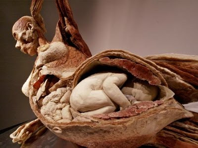
 My previous post on Damien Hirst brought up a discussion between my sister and I about artists who dissect animals and plants for their artwork. She showed me a catalogue from an exhibition she went to on Dr. Gunther von Hagens' work, which I know she has researched and studies quite a bit. I've never really taken much notice of his work before, as I didn't really want to see dissected and stripped human bodies, but some of the ones shes showed me were artistically presented in various ways, using a range of techniques. I also feel strangely more comfortable about his work than I do with Damien Hirst's, as I know all the people he uses have signed up and volunteered for their bodies to be used once they have died. I also spoke to my housemate who is a medic, about Dr. Gunther von Hagens' work, and he was very in interested in seeing some. My sister said that the exhibition attracted a lot of medic students interested in the dissections, as well as art lovers- I think it's great how he's managed to add this unique take on art, and attract many different audiences.