Monday, 24 August 2009

Damien Hirst- my criticism

As this is a blog for our personal opinions and critical analysis, I thought I should express my log term negativity toward the work of Damien Hirst. Although I admire his in depth meaning to his pieces, and the unique solutions he creates, I hate the fact that a lot of his work he doesn't actually create. He does have the initial ideas and concepts, but then he just passes them on to someone else to implement for him, while he receives all the credit notably the various animals he preserves and displays in formaldehyde.

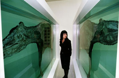
His work has also been criticised a lot in the press, particularly when he won the 1995 Turner Prize. The exhibition of 'Mother and Child Divided' (below), and 'Away From the Flock'. Norman Tebbit who wrote for the Sun, said "Have they gone stark raving mad? The works of the "artist" are lumps of dead animals. There are thousands of young artists who didn't get a look in, presumably because their work was too attractive to sane people. Modern art experts never learn." This is a statement that I strongly agree with- there are so many more talented artists out there.


Saturday, 1 August 2009

Advertiser-Funded Programming

Is AFP the answer for both Advertisers AND Broadcasters?

After reading an article in The Guardian's 27/07/09 Media supplement, it got me thinking about a method of advertising I previously knew little about. This is probably due to the fact that it is a method of advertising that is not widely used, but as the article suggested, it could become a more popular technique, with advantages to both advertisers AND television broadcasters.
Although Advertiser Funded Programming (AFP) has been around since the first American radio soap operas in the 1930s, few advertisers have chosen this method to reach their audiences due to the lack of clear marketing value. However, with the current economical situation, and the recent interactive technological developments, AFP could be the answer that both advertisers and broadcasters are looking for.

Commissioners were initially concerned whether AFP could deliver quality programming, which meant for many years it was considered as a risky choice for broadcasters. Earlier this month however, Nintendo and Channel Five announced a new prime time AFP show they are planning to launch- 'Britain's Best Brain'. The software company Sage also funded the majority of ITV's first prime time AFP last October- 'The Krypton Factor'.

David Brennon, research and strategies manager for the TV marketing body Thinkbox, says AFP will become a more widely used marketing meothd, as although "total sponsorship is estimated at £200m, and AFP is a small subsection of that at the moment... it will surely grow as brands see the power of association." This introduces the idea that more advertisers may recognise AFP as a method of advertising that they could benefit from. For example, target audiences will associate Nintendo DS with 'Britain's Best Brain', which will reinforce its brand profile as an intellectual and "brain training" product.

AFP could also be the answer to the decreasing television programming budgets. Mark Eaves, managing director of Drum PHD (the media agency behind the Krypton Factor deal), says that despite commissioning budgets already being driven towards peak-time terrestrial, "everyone is under pressure now, so any content with new funding is quite welcome."

Is AFP really a good deal for advertisers though? In an AFP deal it is the broadcaster who has the creative control. And with product placement banned in the UK, at the price of some, if not all the production costs, exclusive ads and a mention in the credits has often been considered as not a great side of the deal for advertisers. However, the recent digital interactive developments are making AFP more attractive, as it's moved on from the flat deal of advertisers investing large sums of money with little marketing value in return. Through the medium of the programme and anchoring material, specific audiences can be reached by advertisers through direct links to the brand. For example, a link on ITV.com's Krypton Factor page takes you to Sage's Trainyourbrain.com, offering mental games based on the Krypton Factor style, while promoting the brand. There is also the interactive support of the red button for Sky and digital users, and of course forever developing technology could open up many more interactive options.

Although the current economical situation and recent technological advances would suggest AFP offers many benefits to both advertisers and broadcasters, it's still too risky to jump into. Time and trial are the best measures of success for the method, especially as audience responses are an important consideration, and with current concern as to whether viewers would reject ad-funded programmes.

'Strange Days and Some Flowers'


'Strange Days and Some Flowers' Exhibition
Multiple artists.
The Storey Gallery, Lancaster.

Due to the gallery's copy right restrictions, I am unable to put up photos of the artwork. There are photos on the web site www.storeygallery.org.uk/programme.php?item=000029 and the flickr site www.flickr.com/photos/storeygallery/sets/72157621388108098/

Although I would say this small exhibition isn't worth making any special trips for, I would recommend having a gander if you're around the area, as it's free entry and I quite enjoyed it. It includes paintings, installations, pottery, architecture models and sculptures by the following artists- Dan Baldwin, Don Brown, Laura Ford, Matthew Holding, Robin Mason, Jock Mooney, Mika Rottenberg and John Stark.

The relevance of the title is rather unclear to me, other the the word 'strange' which describes it quite accurately. To me, the link between most of the work apears to be: a surreal and distorted vision of nature and reality that is often a playful and/or dark take on modern society. A good example of this would be Don Brown's 'Yoko XIX' and 'Yoko XVII' sculptures, which are exactly the same apart from the material and the colour- the first one is black and the second white. They are sculptures of a figure that appear to be draped in cloth material. The drape contors are sculptured really realistically and work well with the medium surface texture, as initially I thought it was a shiny latex material draped over. What I found interesting though was that a simple difference of colour can make a big differnece of perception- the black one immediately looked dark, dangerous, threatening and evil, and the white one looked pure, heavenly and peaceful. This colour difference may sound obvious but it made me think about how it relates to the world and our society- due to individual past experiences and social stereotypes, people often differ their views and judgments for two similar situations that have a slight degree of difference, such as age, sex or background for example. It also highlights the importance of colour as a graphic designer, as it can really alter how people decode and view our designs.

Another interesting piece was an installation by Jock Mooney titled 'Discontinued'. It features plastic models placed on and around a large, permanent statue within the gallery, of Queen Elizabeth I (?). It creates the playful and distorted vision of nature that I referred to earlier, with various little models of animals and toy-like figures. My initial perception of it was that it was an immature illustration of life. However, as I looked closer I notised hidden, dark aspects that resebled death and violence including a reef of bones and eyeballs and body parts scattered behind the statue- this was clearly a much more blunt and significant outlook on life than the 'immature' outlook I initially thought. The overall style of the models reminded me of the E4 'Hotel Room' and 'Beach' idents, which caused me to lack admiration for the installation, as I got the strong feeling I'd seen that style before. I have much more admiration and respect for artists and designers who create their own style, so this just gave me a 'nothing special' attitude towards the piece.
I would recommend this exhibition, as it had an interesting variety of work. But like I said- it's a very small exhibition (just 24 works) so not worth any extra trips.

Wednesday, 29 July 2009

Blue

Below are a few points of thought on the colour blue that I've taken from an article in The Guardian written about by Miles Davis' album 'Kind of Blue' (25/07/09, extract from Richard William's book 'The Blue Moment: Miles Davis's kind of Blue and the Remaking of Modern Music'). As we all know, different colours and shades can reinforce various emotions and alter our interpretation of things. But some of these debatable ideas and facts also take blue into account as a word and a music genre, offering possible inspiration for further use and thought of blue- both visually and audibly.
A lot of the article appeared to be so distant from likely interpretations of blue, I would say much of what Richard Williams has written about 'blue' as a colour is probably not even worth taking into account! But it is interesting to read about cultural ideas and artists' views of the colour blue...


- "A nice word to say, and to sing, the gentle explosion of its initial double-consonant immediately softened and then succeeded by a long and shapely vowel."
- 'L'heure bleue' (the blue hour) is a time between work and play defined by "transience and evanescence"- basically a time between two aspects of life, which briefly passes and quickly fades away.
- Blue is the colour of:
the Virgin Mary's cloak
Tribal dyes
The suits worn by J Edgar Hoover's FBI men
Rock 'n' Roll denim
- Some expressions, film and music quotes that have used and phrased various shades of blue: Blue velvet, blue angel, blue valentines, blue moon, blue and sentimental, love is blue, way to blue, midnight blue, almost blue, born to be blue, blue on blue.
- "Goethe dressed Young Werther in a blue coat and, in his 'Theory of Colours', observed that "blue brings the principle of darkness with it"".
- Rilke wrote his poems on blue paper.
- Cezanne believed that by adding blue to every colour on his palette he could create the sense of natural light.
- Kadinsky wrote: "Blue unflods in its lower depths the element of tranquility. The brighter it becomes, the more it loses its sound".
- Matisse once said he was "pierced in the heart" by the blue of a butterflies wings.

My painting of 'The Little Fourteen Year Old Dancer'


Painting of the Sculpture
Acrylic, lace.

By request from Laura! This is a painting I did of the sculpture a few years ago. This was part of a study rather than an actual piece. I think it was part of my GCSE project so it was quite a while ago now! I was very encouraged to capture the use of mixed media, as this is a key aspect of the sculpture that I admire, along with the childish confidence of the pose.

Saturday, 18 July 2009

The Little Fourteen-Year-Old Dancer, Edgar Degas

[Sculpture]
The Little Fourteen-Year-Old Dancer
By Edgar Degas (1834-1917)
1880

This is one of my all time favourite art pieces that I have loved since a very young age! I think I must have loved the innocence and beauty of the stucture, and was inspired by the use of various highly relevant medium, so much I did my own mixed-media painting of it. He carved her with wax, using a real ballet dress and shoes, and horse hair for the hair.
I just read an article in The Guardian that said one of the sculptures (he did a few variations of it) was sold for £5m five years ago, and is now back in the transfer market at £12million. Gutted I'll probably never get to own one! But I saw her last summer at the Liverpool Tate, and she can also be seen in the musee d'Orsay in Paris.

Wednesday, 8 July 2009

Christian Louboutin spring/summer 2009 ad campaign


Fashion ad campaigns are becoming much more than just photo shoot photography of skinny models in expensive clothes. This Spring/Summer, Christian Louboutin has launched a new campaign, resembling the artistic influence of the Baroque era. Peter Lippmann, the still life photographer behind the campaign, has taken inspiration from 17th-18th artworks, particularly painters of the Dutch Golden Age. The shoes have been arranged in still life to resemble classic paintings. I love the unique take on this fashion campaign as, although the style itself is not unique in the art culture, for fashion it is a very original angle. If I were to come up with this concept, particularly for fashion, I would worry that the old fashioned style would create similar impressions of the shoes. However, it has been carried out beautifully, and represents the brand of Christian Louboutin, and Baroque art beautifully.